What makes for a great restaurant website?


"Do I really need a website for my restaurant?"
It's a question I often get asked when discussing our early access programme with potential customers. I always answer the same: "Yes, absolutely, you do!"
I'm biased, of course. I run a company that builds websites exclusively for the hospitality industry. How could I not say yes? Bias aside, I've seen first-hand, over and over again, what a well-built website with compelling content can do for any business.
A perfect example of this was one of the very first websites I ever built. A website for a B&B in Ross on Wye, all the way back in 2004. Their new website was well-designed and had good-quality photography and text that got the message across.
The feedback I got from my customers was that their entire clientele had changed in the weeks after launch.
They found that they suddenly had customers tipping larger amounts and were more appreciative of the accommodation and service. It ultimately allowed them to raise their prices and still succeed.
They hadn't changed anything else about their business and were not paying for any advertising. Still, the website more closely aligned with how the owners wanted their business to be perceived and changed the expectations of customers they were attracting.
But good websites are becoming more expensive. I've worked in the creative industry for nearly twenty years now, and in that time, I've witnessed the cost of websites slowly but surely creep up. Not just in terms of the high initial investment but also in ongoing maintenance and updates.
In light of rising costs, it's easy to see why almost half of all restaurants don't currently bother with a website. Instead, rely on social media and review websites to draw in business.
But, while I understand the motivations behind not running a website, it's still a shockingly high percentage who are missing out on the very tangible benefits a great website can provide.
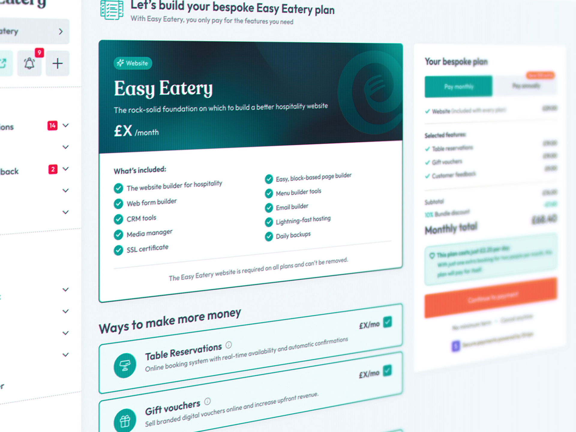
This is why I founded Easy Eatery — because I believe that restaurants deserve better websites for less.
The truth is that websites are more important than ever.
This is because a website can bridge the gap between social media, review sites and the considerable percentage of people who'll discover your business elsewhere.
Places like web searches, Google Local Business and independent local business directories.
Not everyone uses Facebook or Instagram.
And, whilst sites like TripAdvisor are a great source of information, they don't allow your business to stand out and give you little to no control over your own narrative.
A website does this and so much more.
The key benefit of a website is that it provides a central place where you can send everyone to and make a real effort to convert interested parties into paying customers.
A great restaurant website serves a purpose.
I believe that many restaurants have previously given up on websites simply because they had one that didn't get results. More than likely, because the website they had served no purpose.
And when I say 'purpose', I don't mean a purpose in merely displaying contact information and a basic menu. I'm talking about the website having a practical end goal for people using it— and a user experience designed to help make that goal easy to reach.
When it comes down to it, a great restaurant website needs to persuade as many visitors as possible to visit the restaurant and should:
- Build awareness and improve the perception of your brand,
- Clearly communicate critical information, and
- Make it easy to book or contact the business in another way.
Do all three, and you have yourself a great restaurant website!
The Easy Eatery restaurant website checklist of greatness:
Your website should clearly display important information.
One of the main reasons that someone will visit your website is because they're looking for information about your business. People could be looking for:
- Your contact details,
- Your address,
- When you're open,
- What you're serving, and
- If reservations are needed and how to make one.
Making the answers to all your potential customer's questions readily available is a vital first step for your website.
Don't make people search for your contact details. You've probably got a preferred method of contact for new business; either phone or email. Whichever it is, ensure those details are in your header or, at the very least, visible without scrolling down the page, and ensure they're clickable.
Making it easy for someone to call or email direct from your site will impact the number of enquiries you get.
Your address should be easy to find. Typically this would be located at the bottom of the page, within your website's footer. I'd recommend linking off to a 3rd party mapping service, like Google Maps, to allow your customers to get directions. This is something every Easy Eatery site does.
Display your opening hours, and include your serving times if they differ. Your complete opening hours don't need to be on every page; just having this info on your 'about' or 'contact' page is absolutely fine.
You may wish to display your social links prominently, but consider that you should be driving traffic from social to your website and not the other way around.
Add your social media links on every page, but keep them small. Place them in either your header or footer and only display large "call to action" versions of social links in one or two locations. As with your opening hours, your 'about' or 'contact' page is recommended.

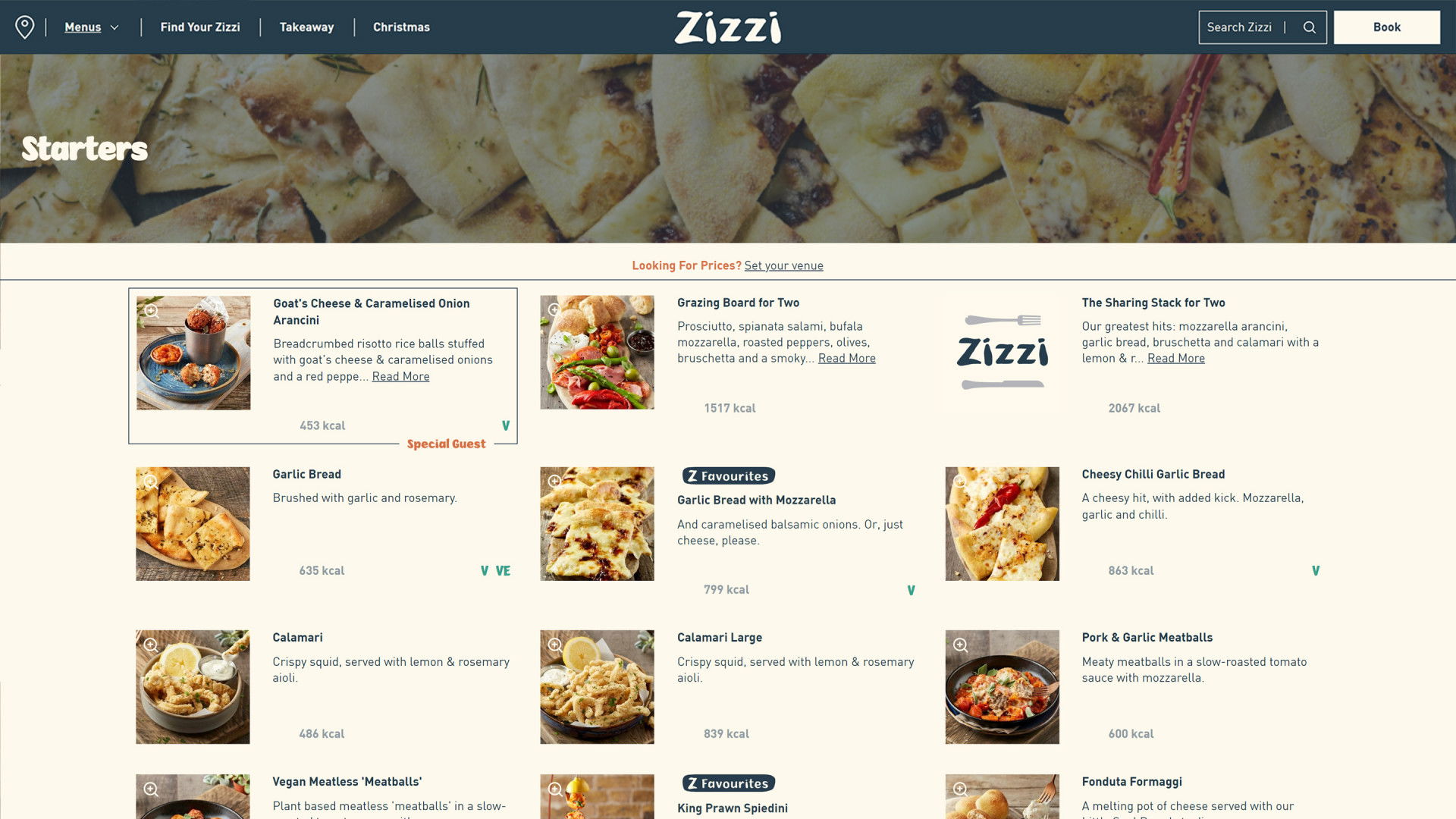
Your website needs to display your menus in an engaging and accessible manner.
9 out of 10 of your potential customers will want to check out your menu before deciding whether to visit or not.
It should be no surprise that a restaurant website's menu pages are typically the most viewed pages after the homepage.
Given the importance of your menus to your customers, it makes sense that they should be promoted appropriately and not be an afterthought, right?
It blows my mind that so many restaurants still rely on PDF menus on their website. Typically, these are just digital copies of the printed menus found in their restaurant. As a result, they provide a really poor experience and don't do your menu justice.
In a previous post, I discussed why PDF menus are a terrible idea. But to summarise, a PDF menu provides a bad experience that will frustrate your customers. You need to present your menu correctly.
What you need is an HTML menu. One that displays your menus in an engaging and accessible manner. One that works great on both desktop, mobile and everything in between. One that is quickly and easily updated.
On this front, we have you covered.

Make it easy for your customers to book, or get in touch.
So, your website has answered all the questions your potential customer had. They know you serve a banging risotto, where you're based and how to get there; what's next?
This is where your primary cta (call to action) comes into play. This feature is often missing from restaurant websites; ironically, it's also one of the most important.
It doesn't need to be more complicated than a button in a prominent location that, when clicked, goes to a page where your visitor can achieve your website's primary goal.
Typically, this would be a form where the person using your website can make a booking or reservation.
Given the importance of this action, it's best to display your primary cta on every page, ideally within the header, ensuring it's always visible without scrolling the page.
Even if you don't take online bookings, chances are a percentage of your customers will want to speak with you before you visiting, so make it easy for them to get in touch with you, by providing a 'contact us' call to action instead.
Don't rely on links within paragraphs or titles, they're less visible than stand-alone links or buttons and will see less engagement.

First impressions really do matter.
The experience in the first 10-15 seconds on your website can be the difference between a booking gained or an opportunity missed. When someone visits your website, they're visiting your business and will judge you, even if they don't mean to.
The standard of your website and the quality of its content are highly influential on a subconscious level.
A well-designed theme, well-written text and beautiful photography are essential in making a solid first impression. Likewise, design mistakes, poorly-written text and poor-quality photos will drive people away. Mistakes erode trust and for first-time customers, trust starts at zero.
As a restaurant owner, you understand the importance of the atmosphere in your venue. Your website is absolutely no different. In fact, you should consider it an extension of your venue.
Everything about your website, right down to the colour palette and choice of fonts, should reflect how you want your business to be perceived.
Yes—even fonts make a difference. As ridiculous as it might sound, it's absolutely true.
Blurry photos will negatively affect how your business is perceived. While there's nothing wrong with photos taken on a mobile phone, so long as they don't look like they were taken on one from 2007.
Only use the best photos on your website and ensure they're in focus and well-exposed. Avoid flash photography if you can — used incorrectly, a flash can make photos look amateurish.
Above all else, your website should be fully functional. I may state the obvious, but broken links, typos and missing images will damage your website's user experience and you will lose business to them.
In light of the negative impact mistakes can have, you should make changes to your website carefully and ensure that any problems are corrected quickly.
A fast website makes a huge difference.
If the first 15 seconds of experience on your website is spent waiting for it to load, people will have a bad time — and so will you.
Perfect design, the best photos, and the most well-written text will matter for nothing if your customers have to sit around waiting for it to load.
People are impatient. Over the past few years, the load time of a website has become a critical factor in how search engines rank web pages in search results.
Search engines, like Google, want to display search results relevant to the user's search term and prioritise those that load quickly. As such, you can see why a slow-loading website will do you no favours.
A slow website will become progressively less visible in search results over time, causing a downward trend in traffic to your site and annoying your visitors.
Your social media following may prop the site up to an extent, but you're missing out on valuable 'organic' search traffic if your site is slow.
Suffice it to say you should do everything possible to ensure that your website loads as quickly. In an earlier post, I discussed the reasons a slow website could hurt your restaurant, and how to fix them — check it out!

The user experience on mobile devices should be just as strong as on desktop.
Responsive web design — designing and building a website to scale to fit any size screen — has been around for over a decade now.
So, unless your website happens to be even older, there's no excuse for it not being responsive. If it is older, congrats for going this long without updating, but perhaps it's time for something new?
Well over 60% of all web traffic is now via mobile devices, so it should be a foregone conclusion that your website be responsive.
A great mobile experience is not necessarily the same as on desktop. In fact, it's actually a good idea if the mobile experience is 'lighter' with less emphasis on interactions and animations.
It's more important that the experience simply be as fast as possible. Load times on mobile are often much longer, thanks to reduced processing power and slower internet connections.
Of course, there's still room for creativity; just don't let it get in the way of the information your customer requires. Ensure your primary call to action is just as potent as on desktop.
Wow! You're still here?
This post wound up a lot longer than I expected, so fair play for sticking it out and reaching the end!
I hope you found the information here helpful. Even if you haven't decided to go with Easy Eatery so far, I hope this post helps you improve your existing website.
See you in the next one!


Why restaurants shouldn’t rely on AI for all their social media graphics

