Form builder - design improvements
ImprovementForm builder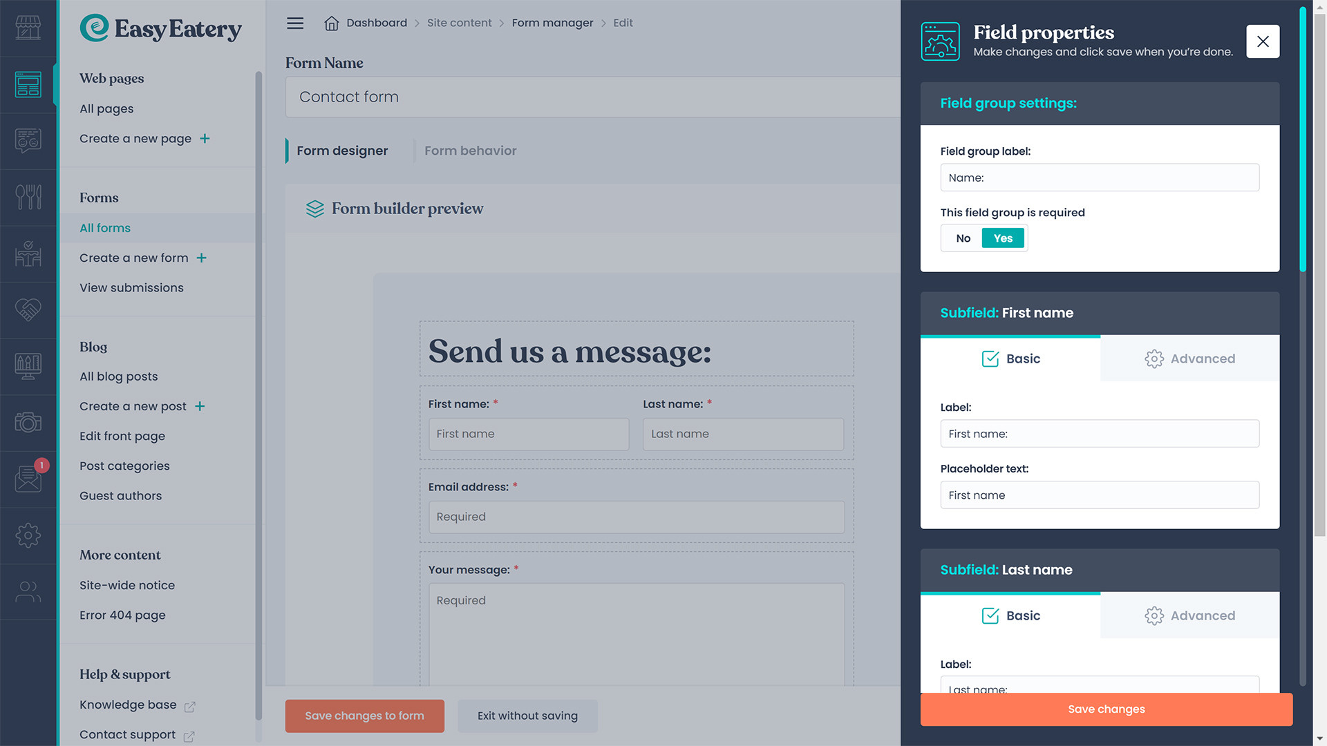

We've reviewed the the form builder and based upon customer feedback have implemented several improvements to the design and user-experience.
Form builder UI review:
We've reviewed the form builder's UI and changed it so that the dotted border around each field is permanently visible.
This helps more easily identify distinct fields and makes it easier to understand the structure of your form at a glance.
We've also ensured that when you add a new field, the form builder is immediately scrolled down to reveal it.
A new approach to editing form fields:
We've completely redesigned the field configuration popup.
The previous implementation was a very basic and offered a basic user-experience.
The new version, pictured above more clearly displays the form field options and groups fields into two types:
- Basic, the most commonly edited options for a given field, such as the field label, if the field is required, etc.
- Advanced, optional fields which alter the behavior of the form field being edited, such as the maximum length of a field's input, or an optional CSS class, etc.
We've added a new field type: True/False.
This new field type adds a binary choice radio button group to the form.
You may customise the labels for each radio button, however the values of the radio button options are always 'true' and 'false' respectively.
